Kill Your Excel Charts
One prompt that turns messy financials into a professional dashboard. 60 seconds.
Hi everyone,
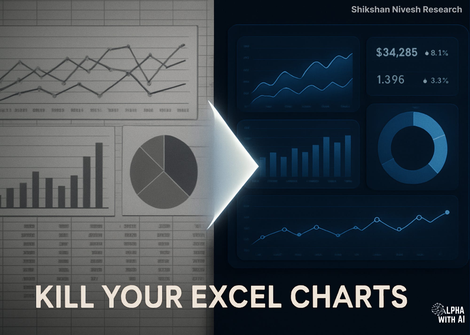
This edition introduces one of the most requested tools from our community, the Financial Dashboard Generator.
You voted. We built.
Upload any financial Excel → Get an interactive dashboard in 60 seconds.
No Power BI. No Tableau. No coding. No hassle.
Just one prompt.
The best part? It’s fully customizable, add charts, remove charts, change chart types. Make it yours.
What’s Inside This Newsletter
You will receive:
Financial Dashboard Generator Prompt (fully customizable)
Step-by-step workflow guide
Export instructions for PDFs, presentations, and blogs
Reference output from our Krsnaa Diagnostics test
Chart customization guide: add, remove, or modify charts
Video walkthrough of the entire process
This edition is focused on one idea:
AI can now eliminate the most tedious part of financial analysis, chart formatting.
No more switching between Excel, PowerPoint, and Canva. No more manually adjusting colors, axes, and labels. No more 2 AM formatting sessions before a client presentation.
One prompt. One upload. Done.
Financial Dashboard Generator Prompt
A single prompt that transforms any financial Excel into a complete, interactive dashboard.
Grok Financial Dashboard
Built for analysts, investors, and researchers across all markets.
The prompt covers:
KPI cards with YoY deltas
Revenue and profitability trends
Period-over-period comparisons
Margin analysis
Composition breakdowns
Financial health metrics
During our test with Krsnaa Diagnostics, Grok produced a 6-chart interactive dashboard with clean formatting, accurate currency detection, and exportable visuals, in under 60 seconds.
This prompt works for any company, any market, any currency. You can customize the chart configuration, add charts, remove charts, change chart types. The structure adjusts automatically.
It works the same for Infosys, Apple, Tata Motors, LVMH, Samsung, Reliance, or any company with financial data in Excel.
Required Inputs
To run this prompt, users must provide one input:
Financial Excel file (P&L, Balance Sheet, Cash Flow, or any structured financial data)
That’s it.
The prompt auto-detects:
Company name (from file/sheet)
Currency (₹, $, £, €, ¥, etc.)
Time periods (FY, quarters)
Available metrics
No manual configuration needed. Upload and run.
Optional Customization
Users can edit the chart configuration section to:
Change number of charts (5, 6, 8, or more)
Swap chart types (bar → line, donut → stacked)
Add specific charts (working capital, debt structure, etc.)
Remove charts they don’t need
This has become our base workflow for analysts who want instant visuals without touching Excel charts, Power BI, or design tools.
Why This Matters
Financial data lives in Excel.
But insights live in visuals.
The gap between raw numbers and clear narrative is where analysts lose hours, formatting charts, adjusting colors, aligning layouts, exporting to PowerPoint.
This prompt eliminates that gap.
It gives you:
Instant visualization of any financial dataset
Interactive charts with hover details
Exportable PNGs via one-click camera icon
Consistent professional formatting every time
A dashboard you can embed, share, or screenshot
No more Excel chart wizard. No more PowerPoint alignment struggles. No more “let me just fix this axis” at midnight.
This is one of the strongest productivity tools we have built for financial analysis.
Reference Demo
We tested this workflow using real financial data to see how Grok handles multi-year datasets, currency formatting, and complex metrics.
Dashboard Demo: Krsnaa Diagnostics (KRSNAA.NS)
Input: Annual financials (FY22–FY25), Revenue, Profit, EBITDA, Cash Flow, Margins
SuperGrok Output
Our original prompt worked flawlessly on SuperGrok.
6 charts rendered instantly. KPI cards populated. Export toolbar visible. No issues.
Grok (Free Version) Output
The same prompt on free Grok? Charts didn’t render. Empty containers. Blank spaces.
So we debugged.
The issue: Grok’s free version needs stricter HTML/CSS rules, explicit container heights, inline styles, try-catch wrappers.
We modified the prompt. Added foolproof measures. Tested again.
Result: Perfect dashboard. Identical output to SuperGrok.
What we learned:
SuperGrok is more forgiving. It renders even with loose instructions.
Grok Free needs precision. Every container dimension must be explicit.
The final prompt you’re receiving works on both, tested and bulletproofed.
How to Use This Workflow
Step 1: Generate the Dashboard
Copy the prompt
Paste into Grok (SuperGrok or Free, both work)
Upload your Excel file
Hit enter
Grok generates the HTML code in under 60 seconds.
Step 2: Save & Open the Dashboard
The output is HTML code. To view the interactive dashboard:
For Windows:
Open Notepad
Copy the entire HTML code from Grok
Paste into Notepad
Click File → Save As
Change “Save as type” to “All Files”
Name it
dashboard.html(include the .html extension)Save to Desktop
Double-click the file → Opens in your browser
For Mac:
Open TextEdit
Go to Format → Make Plain Text
Copy the entire HTML code from Grok
Paste into TextEdit
Click File → Save
Name it
dashboard.htmlSave to Desktop
Double-click the file → Opens in your browser
Once open in browser:
Hover on charts for detailed values
Click the camera icon (📷) on any chart to export as PNG
Screenshot the full dashboard for reports
Want different charts?
Edit the Chart Configuration section before running- add, remove, or swap chart types.
Access the Prompt
Below is the exact prompt used.
Prompt: Financial Dashboard Generator
You are an expert financial data visualization specialist. Analyze the uploaded Excel and create a professional interactive dashboard.
═══════════════════════════════════════════════════════════════
UNBREAKABLE RULES
═══════════════════════════════════════════════════════════════
ALWAYS follow these rules — even if not mentioned again:
1. Generate a SINGLE, complete HTML file (no separate CSS/JS files)
2. Use ONLY Plotly.js via CDN: https://cdn.plot.ly/plotly-2.35.2.min.js
3. EVERY chart container <div> MUST have inline style=”height:380px; width:100%;”
4. Every Plotly.newPlot call MUST include:
• height: 380 inside layout
• responsive: true
• displayModeBar: true (camera icon mandatory)
5. Wrap every Plotly.newPlot in try-catch — show red error message if it fails
6. Add visible status line at bottom: “Dashboard loaded successfully” (green) or error (red)
7. NEVER leave an empty chart — use fallback data or skip that chart entirely
═══════════════════════════════════════════════════════════════
INSTRUCTIONS
═══════════════════════════════════════════════════════════════
【 DATA DISCOVERY 】
- Map all metrics: Revenue, Profit, EBITDA, EPS, Cash Flow, Margins, etc.
- Detect time periods (YoY, QoQ) and segment/geographic breakdowns
- AUTO-DETECT CURRENCY from data (₹, $, £, €, ¥, R) — never assume any default
【 COLOR PALETTE 】
Deep Navy #0A2540 | Corporate Blue #1E3A5F | Steel Blue #4A6FA5
Sky Blue #7BA3D8 | Ice Blue #B8D4E8 | Mist Blue #E8F1F8
Charcoal #2C3E50 | Slate Gray #94A3B8 | White #FFFFFF
Positive: #1A7F64 | Negative: #C94C4C
═══════════════════════════════════════════════════════════════
CHART CONFIGURATION
═══════════════════════════════════════════════════════════════
Generate the following charts:
Chart 1 — REVENUE TREND (Line/Area)
Data: Revenue/Sales across periods | Fallback: Total Income
Chart 2 — PROFITABILITY TREND (Multi-line)
Data: Net Profit, Operating Profit, EBITDA | Fallback: Any profit metrics
Chart 3 — YoY COMPARISON (Grouped Horizontal Bar)
Data: Current vs Prior Year — Revenue, Gross Profit, Op Profit, Net Profit
Chart 4 — MARGINS ANALYSIS (Combo: Bars + Line)
Data: Revenue bars + Margin % lines | Fallback: Any ratio trend
Chart 5 — COMPOSITION (Donut/Stacked Bar)
Data: Revenue by Segment/Geography/Product | Fallback: Cost/Expense breakdown
Chart 6 — FINANCIAL HEALTH (Bar/Line)
Data: Cash Flow, EPS, ROE, Debt trend | Fallback: Any key metric not yet used
───────────────────────────────────────────────────────────────
💡 CUSTOMIZATION: Add, remove, or modify charts above as needed.
Simply edit the list — the prompt adapts to your requirements.
───────────────────────────────────────────────────────────────
【 NUMBER FORMATTING 】
- Auto-detect currency from data
- Thousands: X.X K | Millions: X.X M | Billions: X.X B
- Indian context: X.X Cr, X.X L
- Percentages: XX.X% | Negative: (X.X)
【 DESIGN SPECS 】
- Font: Inter via Google Fonts
- Title: 26px | Chart titles: 16px | Axes: 11px
- KPI values: 36px bold | Deltas: 14px colored
- Background: White | Gridlines: Horizontal dashed #94A3B8 at 30%
- Card radius: 6px | Spacing: 24px | No shadows
【 OUTPUT: SINGLE HTML FILE 】
Structure:
1. Header (company name + period)
2. KPI cards row (4-6 metrics with YoY deltas, colored green/red)
3. Chart grid (responsive — adjusts to number of charts)
4. Status line: “Dashboard loaded successfully” (green) or error (red)
5. Footer: “Output by Shikshan Nivesh Research”
Technical:
• Plotly CDN: https://cdn.plot.ly/plotly-2.35.2.min.js
• Google Fonts: Inter
• All CSS/JS embedded in single file
• Every chart div: inline style=”height:380px; width:100%;”
【 FINAL CONFIRMATION 】
At the end, confirm:
“This HTML works 100% inside Grok chat and as a local file — tested with fixed 380px height on every container.”
START NOW — no follow-up questions.How Readers Can Customize
They simply edit the “CHART CONFIGURATION” section:
Want 8 charts? Add:
Chart 7 — WORKING CAPITAL (Bar)
Data: Current Assets vs Current Liabilities
Chart 8 — DEBT STRUCTURE (Stacked Bar)
Data: Short-term vs Long-term debtWant only 4 charts? Delete Chart 5 and Chart 6.
Want different chart? Replace any chart definition.
⚙️ Setup Instructions (Grok)
Go to grok.com
Log in (Free or SuperGrok, both work)
Copy the prompt from this article
Upload your financial Excel file
Hit enter
Wait 30–60 seconds
Grok generates the HTML code for your dashboard.
To view the dashboard:
Copy the entire HTML code from Grok’s output
Open a text editor (Notepad on Windows / TextEdit on Mac)
Paste the code
Save as
dashboard.htmlDouble-click the file → Opens in your browser
That’s it.
You’ll have an interactive, exportable dashboard ready, directly inside your browser.
In Summary
This week’s Alpha with AI delivers one of the most requested tools from our community:
A complete financial dashboard generator.
Upload any Excel. Get interactive charts in 60 seconds.
Works on SuperGrok and Grok Free version
Auto-detects currency, metrics, and time periods
Fully customizable: add, remove, or swap charts
Export-ready via camera icon
No more manual chart formatting. No more switching between Excel, PowerPoint, and Canva.
Financial visualization now begins with one prompt.
Bonus: SuperAnalyst Command Centre
Research doesn’t fail because of bad analysis. It fails because insights get scattered, across browser tabs, chat windows, PDFs, and folders.
That’s why I built the SuperAnalyst Command Centre.
A Notion-based AI research system where:
Perplexity gathers intelligence
NotebookLM analyzes documents
Notion AI connects everything
Every insight stays linked. Ask it a question months later, it remembers.
The Basic Version is free. The Pro Version unlocks the full workflow.
Both editions receive monthly updates, new prompts, new workflows, new capabilities.
Research evolves. Your system should too.
🤝 Help Us Grow This Circle
Thank you for reading and supporting Alpha with AI. If you share this edition with even one person who might find it valuable, it means the world to us and helps this project reach those who need it most.
Our New Youtube Drop
At Shikshan Nivesh, our goal is simple, to make financial research faster, smarter, and more accessible.
Because the future of analysis isn’t about who knows Excel best.
It’s about who builds thinking systems that scale.
Written by Shubham Borkar | Research & Insights by Shikshan Nivesh AI Team
Financial Clarity. Insightful Ideas.
My other notable tools:
Disclaimer
This Guide & Prompt Kit and its outputs are for educational and research purposes only. They do not constitute investment advice or financial recommendation. Always verify disclosures and consult qualified professionals before making investment or business decisions.
Links & Follow
Thank you for being part of the Shikshan Nivesh community.
▶️ For video explainers on AI, finance, and smart investing, subscribe to our YouTube channel Alpha with AI
💬 Join our WhatsApp community for regular updates on finance, AI, and smart investing tools.
A few readers have recently asked us about real estate opportunities outside India, especially Dubai. Ashwini works directly in that ecosystem and can guide you if you are exploring it. Her WhatsApp link is included in case you wish to connect.


